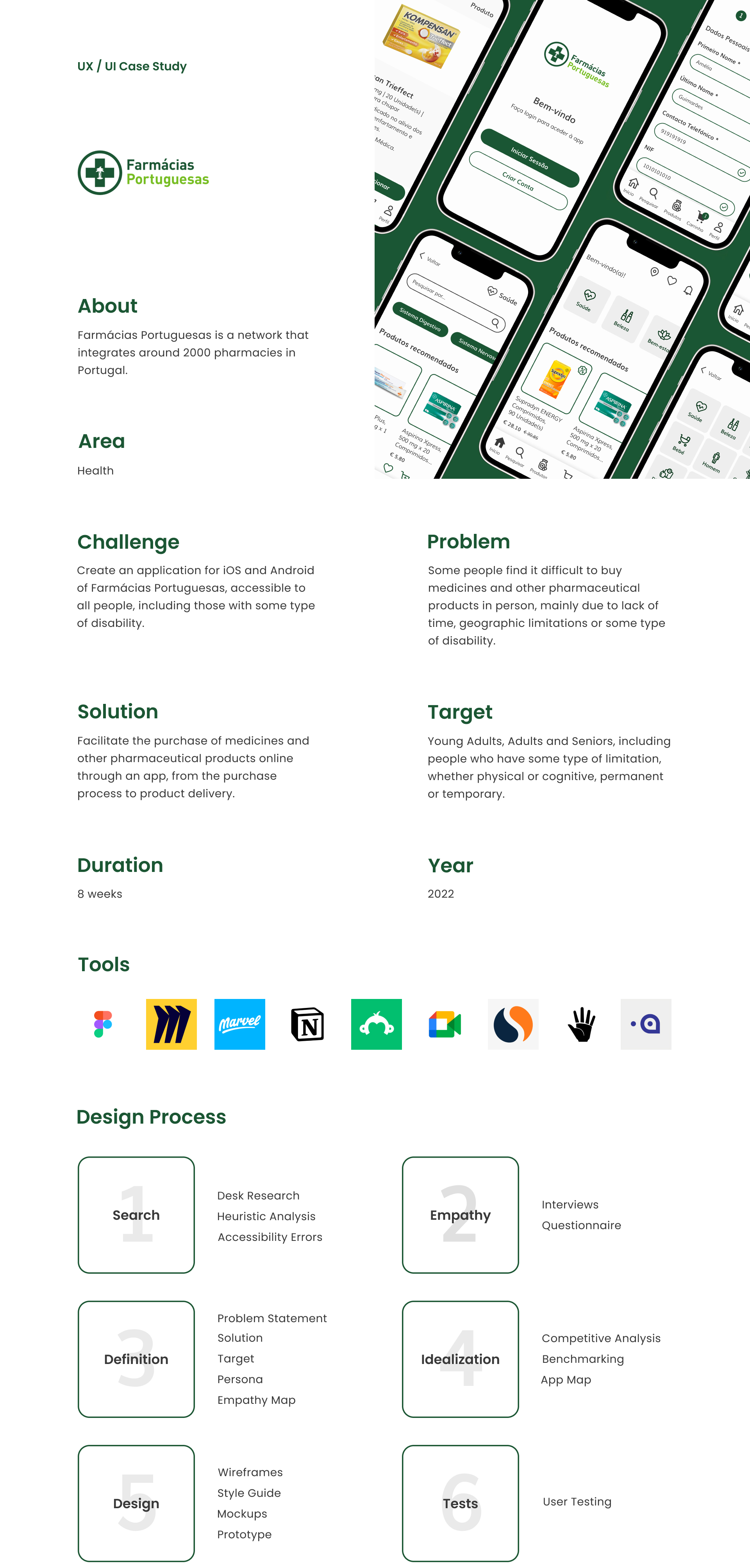
Farmácias Portuguesas
About
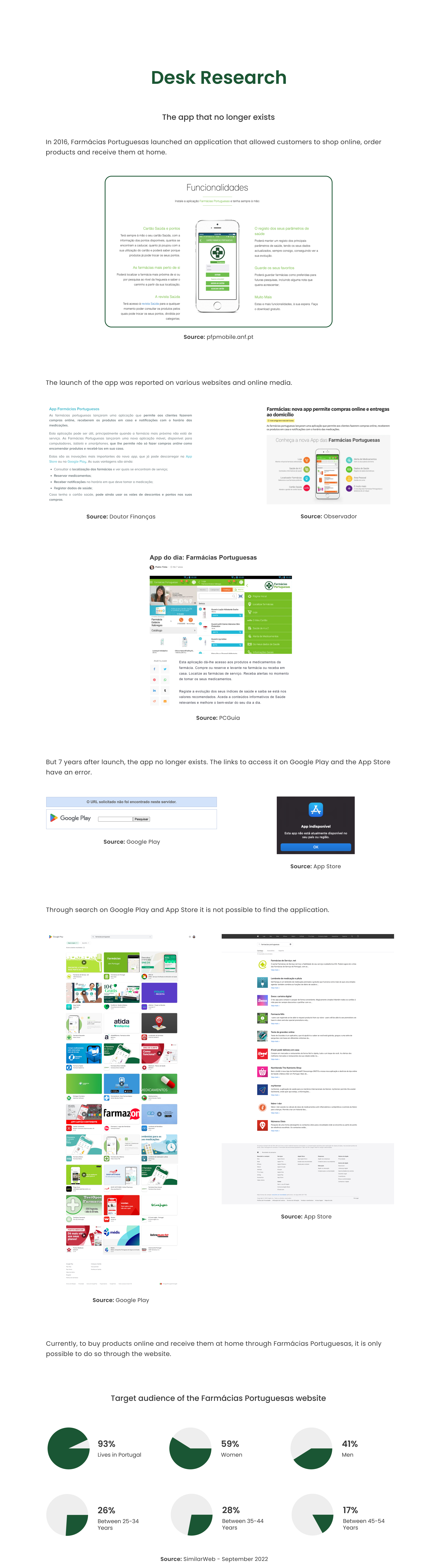
Farmácias Portuguesas is a network that includes around 2000 pharmacies in Portugal.
Problem
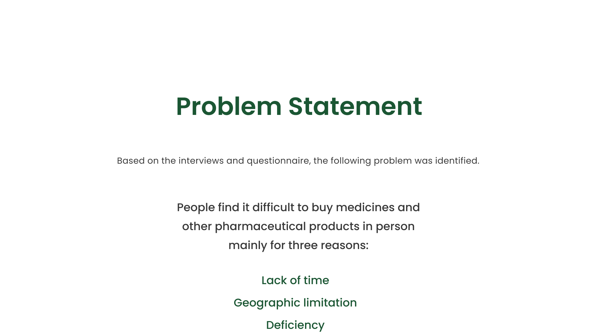
Some people find it difficult to buy medicines and other pharmaceutical products in person, mainly due to lack of time, geographic limitations or some type of disability.
Solution
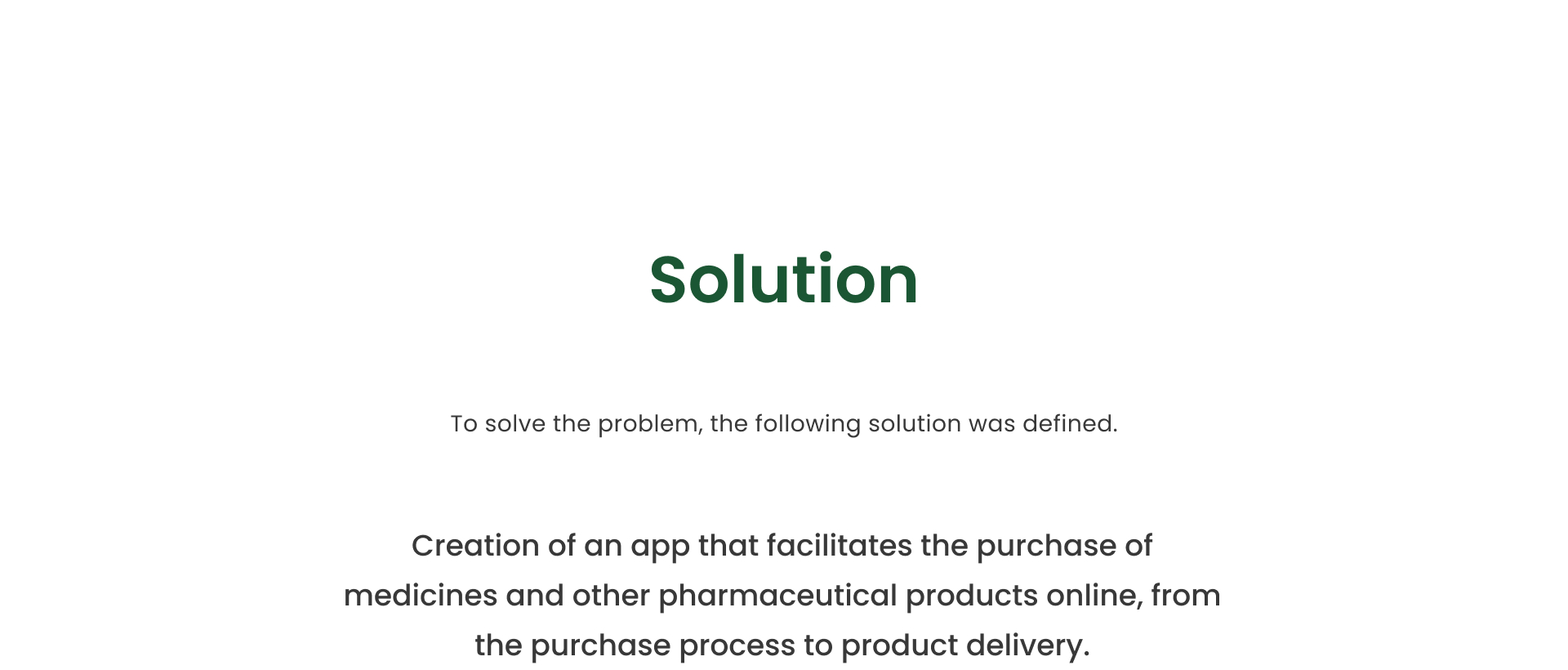
Facilitate the purchase of medicines and other pharmaceutical products online through an app, from the purchase process to product delivery.
Methodologies
Desk Research
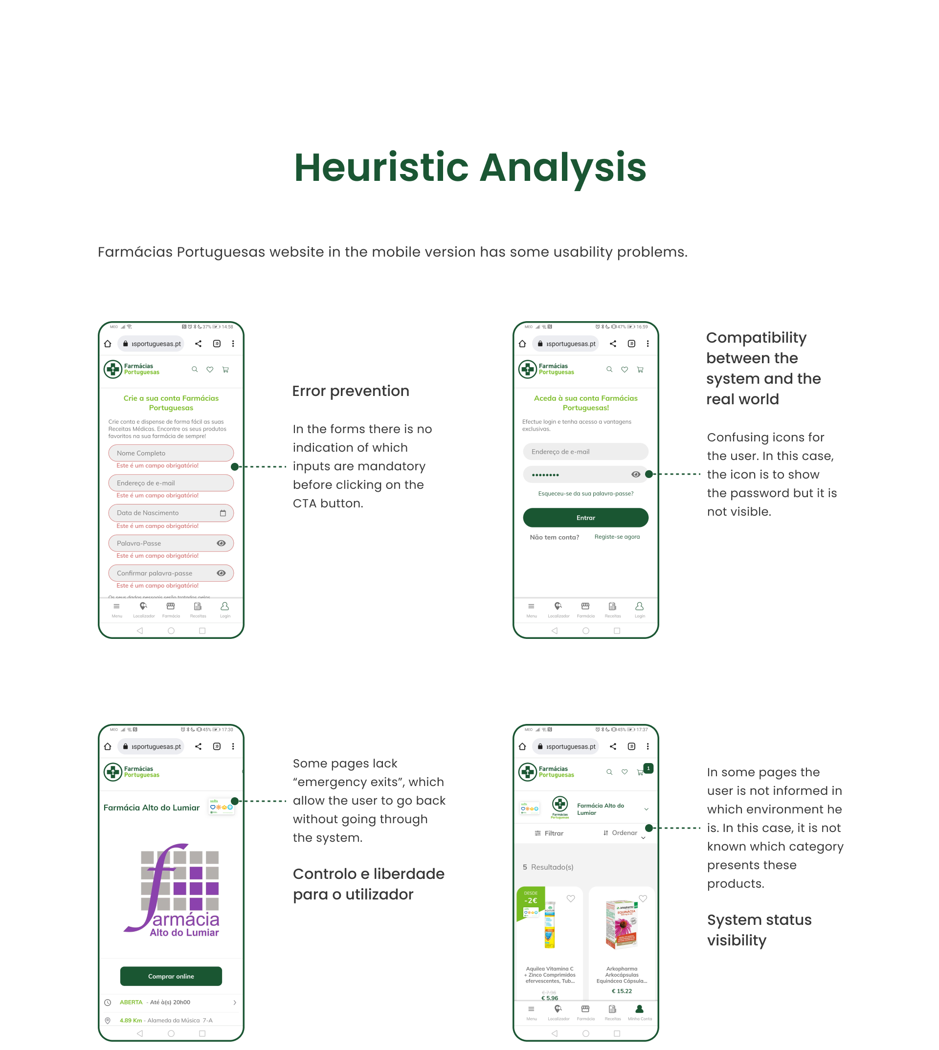
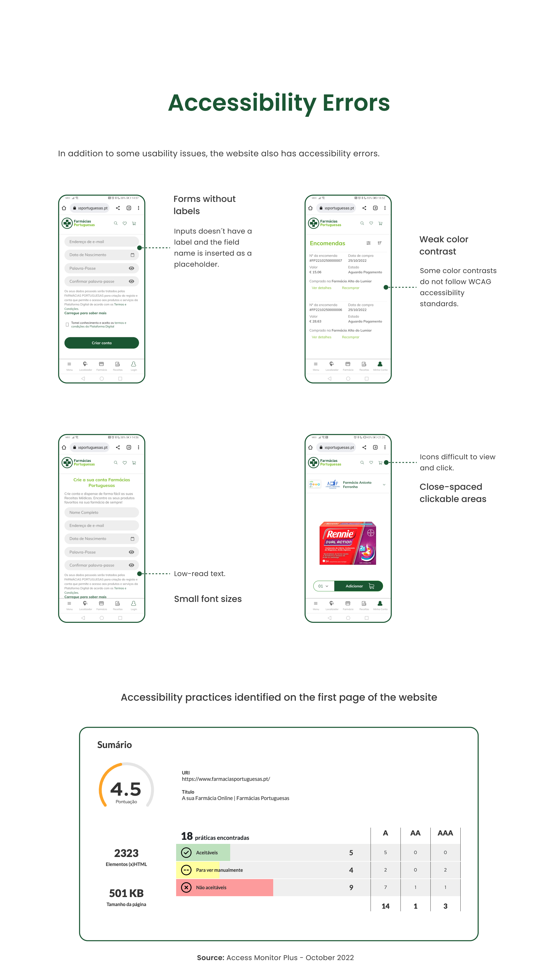
Heuristic Analysis
Interviews
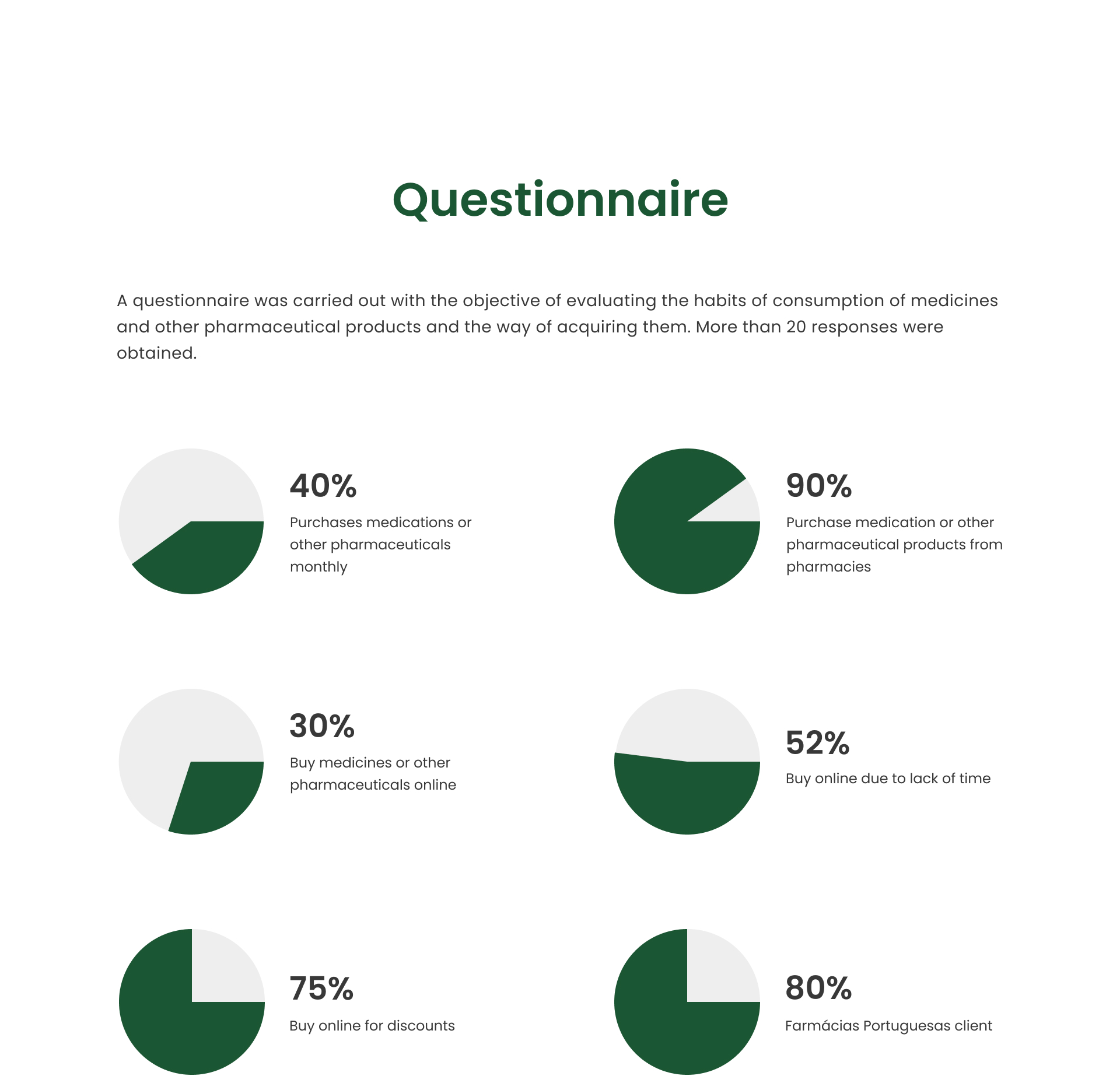
Questionnaire
Personas
Empathy Map
Competitive Analysis
Benchmarking
AppMap
Wireframes
Style Guide
Mockups
Prototype
User Testing